Monday, June 21, 2010
The Message
This is a Gothic Illustration I made a few months ago. The concept of this illustration was to use color in a very subtle way to depict a dark scene.
Small Still Life
Forest
Saturday, June 5, 2010
Clean up of my Grandmother's Old Photo
This was the original photo. There were many
problems with it, including the painted eyelashes.
The scanner also added some extra dust particles and scratches.
problems with it, including the painted eyelashes.
The scanner also added some extra dust particles and scratches.
After a few hours of working on it, I was able to clean the entire image.
I fixed the eyelashes and burned the background just a bit to add some contrast.
A detail of the fixed eyelashes and all the other imperfections.
Portraits of Julie & James
New Central Park
Greed
Paint and Perspective
I feel that this illustration was relatively easy to work on. It took me only about a day to finish it from beginning to end. I took about 30 photos of different objects related to painting. For some reason most people miss the light posts that are also brushes!! I used Photoshop for this digital illustration.
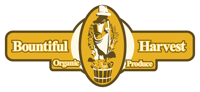
Logo Design
Although I do not consider myself to be a graphic designer I feel like I have a good sense for design. This and my love for vector images have led me to explore areas like logo design. This has become a really interesting and fulfilling area for me. Most of these logos were based on sketches I came up with that later on became logos in Illustrator. This top logo was meant to be used for a store that offered organic products.
I created this logo in order to use it as a part of a restaurants visual identity. One of the things I find interesting about logo design is the interaction of text and images. I am usually used to dealing with nothing but images to convey certain information. Text is very interesting and hard to deal with in a successful way.
Finally this logo was part of a campaign that had as a goal to bring art to less fortunate students. The whole idea behind it was to recycle different materials to buy art supplies for those who couldn't afford them. The name of the campaign was "Recycling Dreams."For this reason the three hands are forming a recycle logo. Each hand holds an art supply such as charcoal and brushes. The hand at the top holds a plastic bottle to emphasize the importance of recycling for the program to function.
I created all of these logos as part of different assignments for different classes. None of them were used in actual jobs, which would have been ideal for me ha ha ha.
I created this logo in order to use it as a part of a restaurants visual identity. One of the things I find interesting about logo design is the interaction of text and images. I am usually used to dealing with nothing but images to convey certain information. Text is very interesting and hard to deal with in a successful way.
This logo was for a TV network that focused on pets. I felt that dogs are a very common pet or even the most iconic one we know. For that reason I decided to use the image of a friendly dog as part of the logo. Nonetheless, this channels had also different programs that involved
other types of pets.
Finally this logo was part of a campaign that had as a goal to bring art to less fortunate students. The whole idea behind it was to recycle different materials to buy art supplies for those who couldn't afford them. The name of the campaign was "Recycling Dreams."For this reason the three hands are forming a recycle logo. Each hand holds an art supply such as charcoal and brushes. The hand at the top holds a plastic bottle to emphasize the importance of recycling for the program to function.
I created all of these logos as part of different assignments for different classes. None of them were used in actual jobs, which would have been ideal for me ha ha ha.
A view in Central Park
This is another vector image I created in Illustrator. I feel that it is important as an artist to always base my work on my own photographs when possible. Therefore, I based this vector image on my own photograph. This piece was difficult to work on since I had to force a 2 point perspective view on a photo with a 3 point perspective view. It was relatively easy to work on certain areas. However, I found areas that had to be so far away from the original picture in order to retain the preciseness of the actual vector, that was very hard to make the image look believable. I only used flat shapes for this image. That means no gradients or anything like that. It took me about about 35-40 hours to finish it. All done in Illustrator.
Still Life
This is one of the illustrations I am most proud of. It was very challenging and very frustrating at times. I feel that I knew how to use illustrator before working on this image. However, I felt even more comfortable with the program and with my skills after finishing this illustration. I feel like I learned so much about the program and about my abilities when I was done with it. It took me over 50 hours to finish it. It was a lot of work but I would gladly do it again in order to achieve even better results. This is all vector and I used gradients and the great Gradient Mesh Tool. Illustrator CS4.
Hand Study
This was a study of my left hand focusing on the relationship between muscles, bones and the effect on the outer appearance of it. It was difficult to maintain the same pose for such long periods of time but it was great to do another study of my hands. I used graphite pencils and copic markers on bristol board. The background was very difficult to deal with so I replaced it in photoshop to enhance the overall appearance of the drawing. It took me about 6 hours to finish the drawing itself. Cleaning it up in photoshop were an additional 2 hours.
"Boy Playing the Flute"
This is my graphite version of Judith Leyster's "Boy Playing the Flute." It was very useful to copy a great master like her. Her work is very inspiring and is just as good as any other old master, of course with her own identity and style. The color image is a picture of the original painting. 1630-35.
Oil on canvas, 73 x 62 cm.
FLY-64 Dragon.
I
did this Illustration about 3 years ago and I still find it very
interesting. I feel that this illustration helped me solidify my
picture-making process. I felt like I knew what I was doing for every
step I took. The results were very satisfying. The creature itself is a
mixture of a dragonfly and a helicopter. Very simple idea but
challenging to visualize. I used a good range of graphite pencils going
from 3H-9B. It took me about 17 hours to finish it over a period of 2
weeks. This drawing was too large for me to scan it so a photograph had
to help me with it. It was incredibly hard to clean up since there were
lighting variations.
Still Life and Abstraction
This is an old drawing but i like it very much.
It was one of my first times working with decent drawing paper.
The still life that I had was very interesting.
It took me about 10 hours to finish it but I kept going back to it.
I used a very soft graphite pencils like 6-9B.
It was one of my first times working with decent drawing paper.
The still life that I had was very interesting.
It took me about 10 hours to finish it but I kept going back to it.
I used a very soft graphite pencils like 6-9B.
This is an abstract drawing based on the original still life.
This was done in micron pens and color pencils.
It was incredibly interesting to create an abstract piece of work since I am usually not interested in abstraction. I found out that it's much more difficult than drawing from life. I think it's because for the original still life,I had everything I needed in front of me. This abstraction was much more difficult to visualize.
Skin, Muscles and Bones.
Anatomy Drawings VI
Anatomy Drawings V
how much I learned from it.
I really took my time to observe everything
and break it down into geometric shapes
40 min pose, charcoal on toned paper.
and break it down into geometric shapes
40 min pose, charcoal on toned paper.
Anatomy Drawings IV
Anatomy Drawings III
Anatomy Drawings
These are some of the most successful drawings I have done from actual models not photographs. Using toned paper has definitely become a need for my life drawings. I feel that it takes away some of the work I encountered when using white paper since it takes care of most of the middle tones in a given drawing.
Subscribe to:
Posts (Atom)